Olive Kornfeld
Amanda Moe
Paovsim Soeung
Maxwell Brooks
Team
Duration
9 Weeks
Instructor
Karen Cheng
During the course of this project, we explored the fundamental principles of designing typography, from establishing consistent proportions to understanding the relationship between form and function. We studied how subtle variations in weight, contrast, and curvature can influence readability and expression. This process allowed us to apply theoretical principles directly to our own typeface, reinforcing how intentional design decisions shape a coherent visual identity.
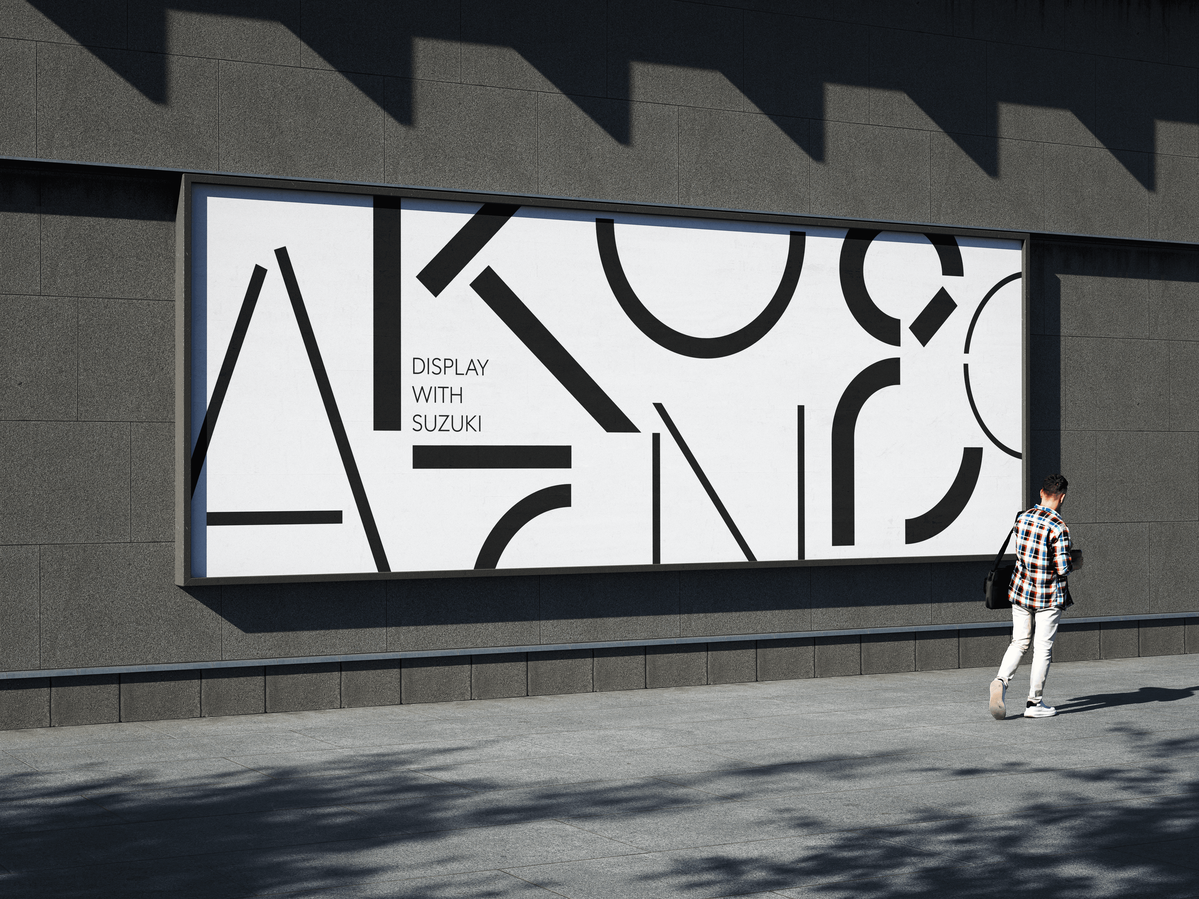
The Suzuki Typeface intended as a bold display typeface, designed to command attention at large scales while maintaining clarity and strong visual impact. It is suited for applications such as wayfinding systems, exhibition graphics, posters, environmental signage, and other contexts where immediate readability and distinctive presence are essential.


